
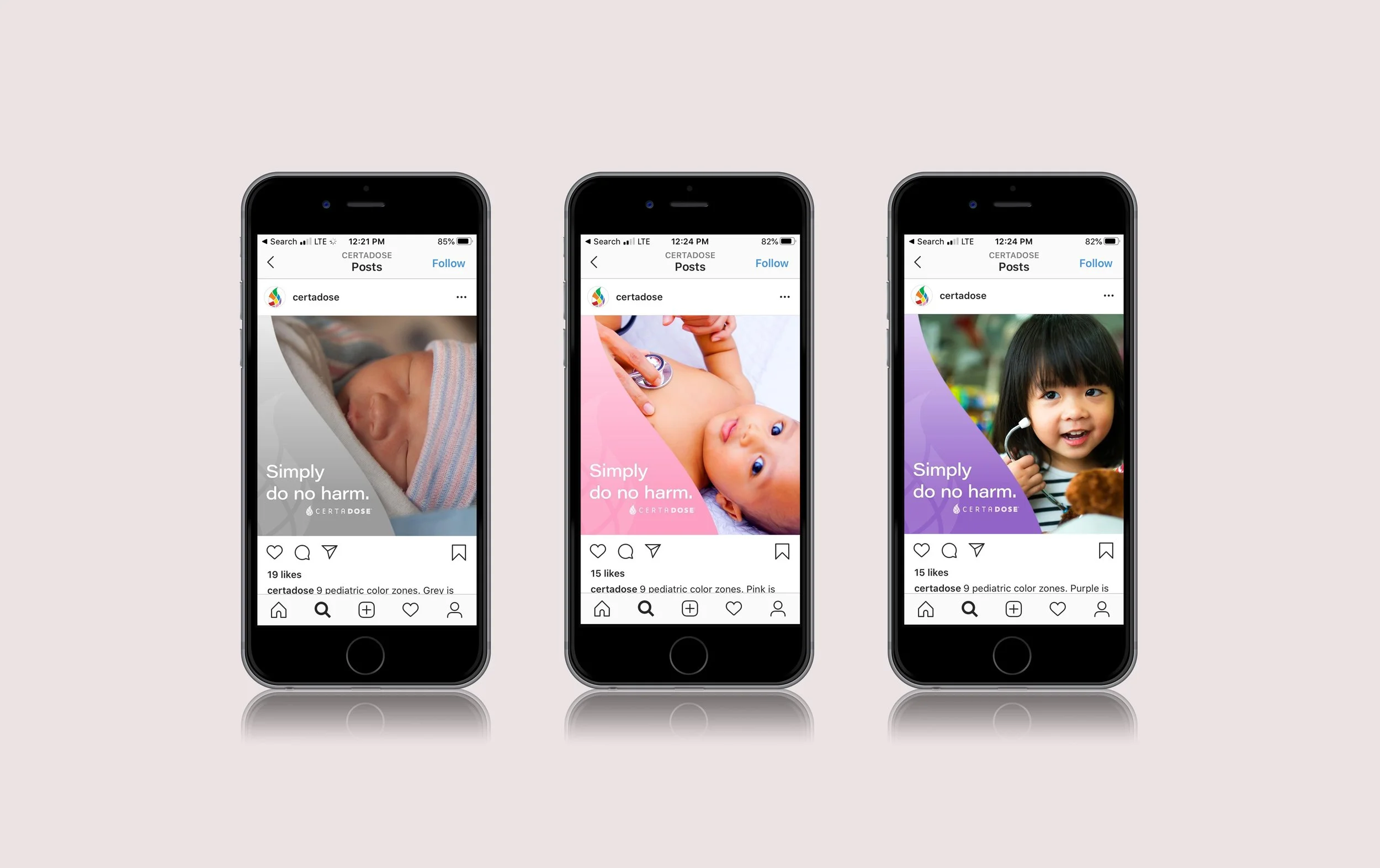
Certa Dose
Certa Dose is a medical startup with a deceptively simple mission: redesign pediatric syringe labels to reduce accidental overdoses. The stakes couldn’t have been higher, and the solution had to work for everyone involved, from hospital administrators to ER physicians to busy nurses.
I started with the colors. The syringes themselves used bright color zones for dosing, and I let that palette become the foundation of the brand. But I wanted to go further. As children grow, their dosage changes, and I made that evolution part of the visual language. The colors shift and adapt, turning a clinical necessity into something that actually feels personal.
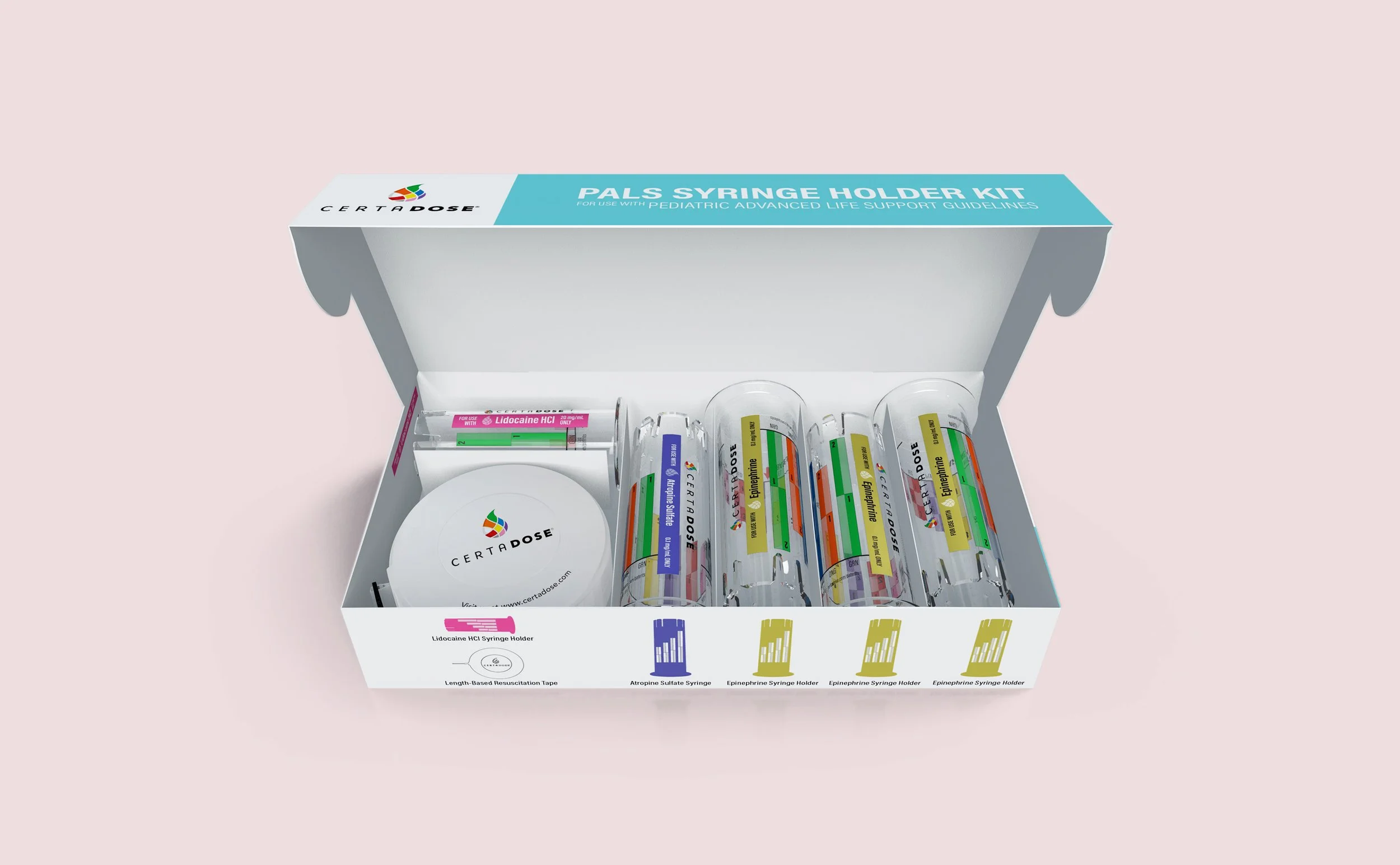
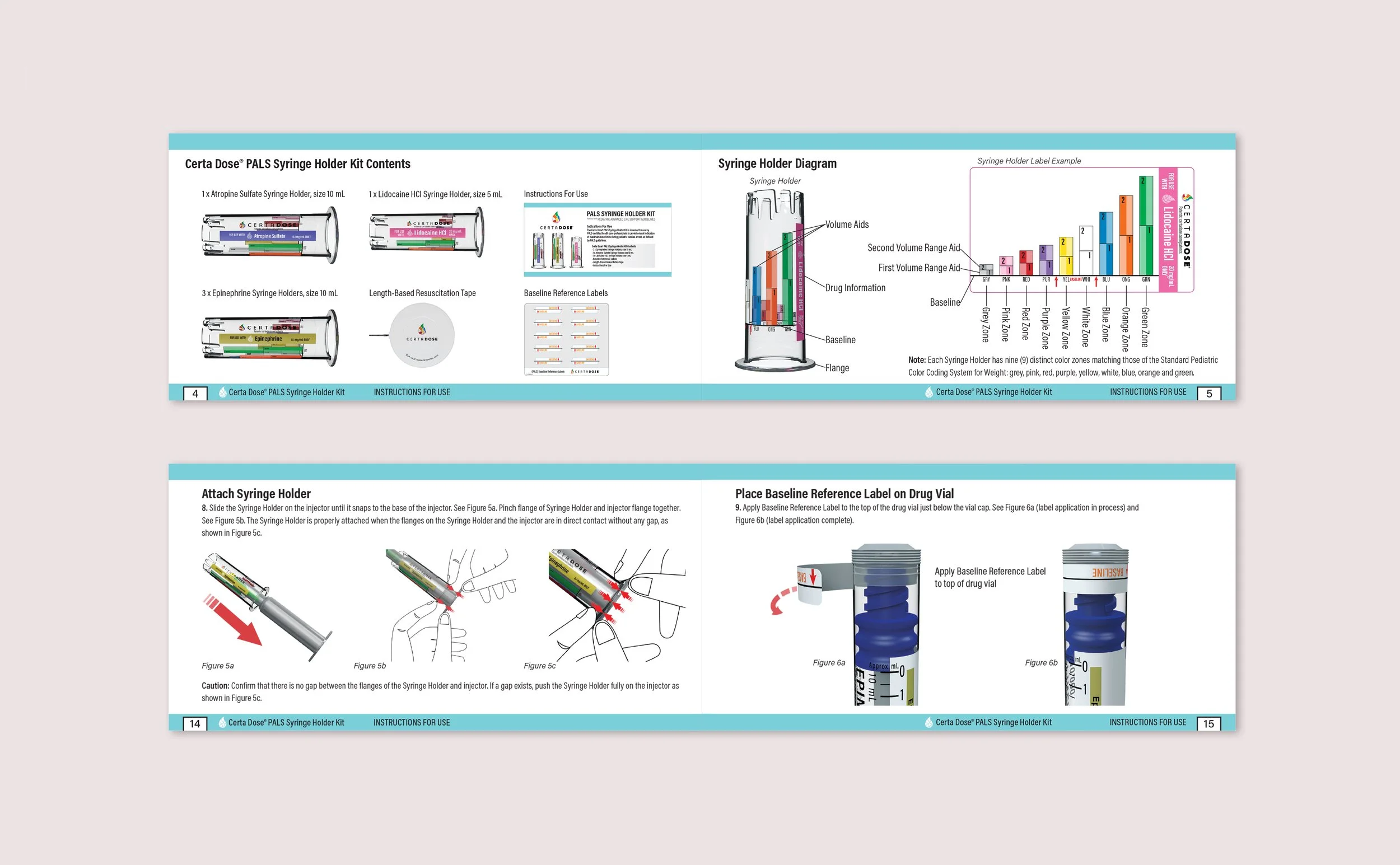
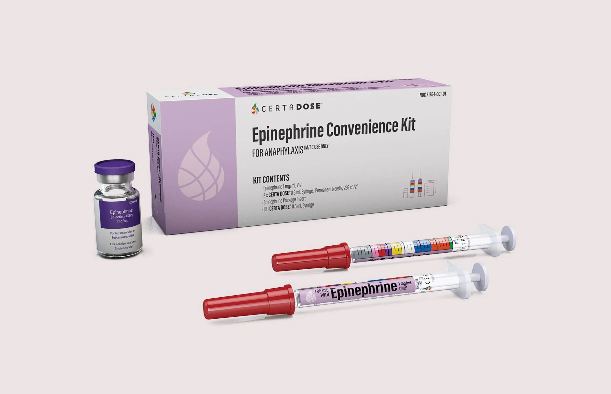
From a single logo, I expanded the identity across packaging, digital, social, print, marketing, trade show booths, web, and instructional videos. Every piece had to do two things at once: instill trust and be instantly readable for medical professionals who don’t have time to second-guess. The FDA approved labels speak for themselves. But the real win was creating a brand that made something as scary as a syringe feel a little more human.
Credits
Agency:
HSC.TV
More work
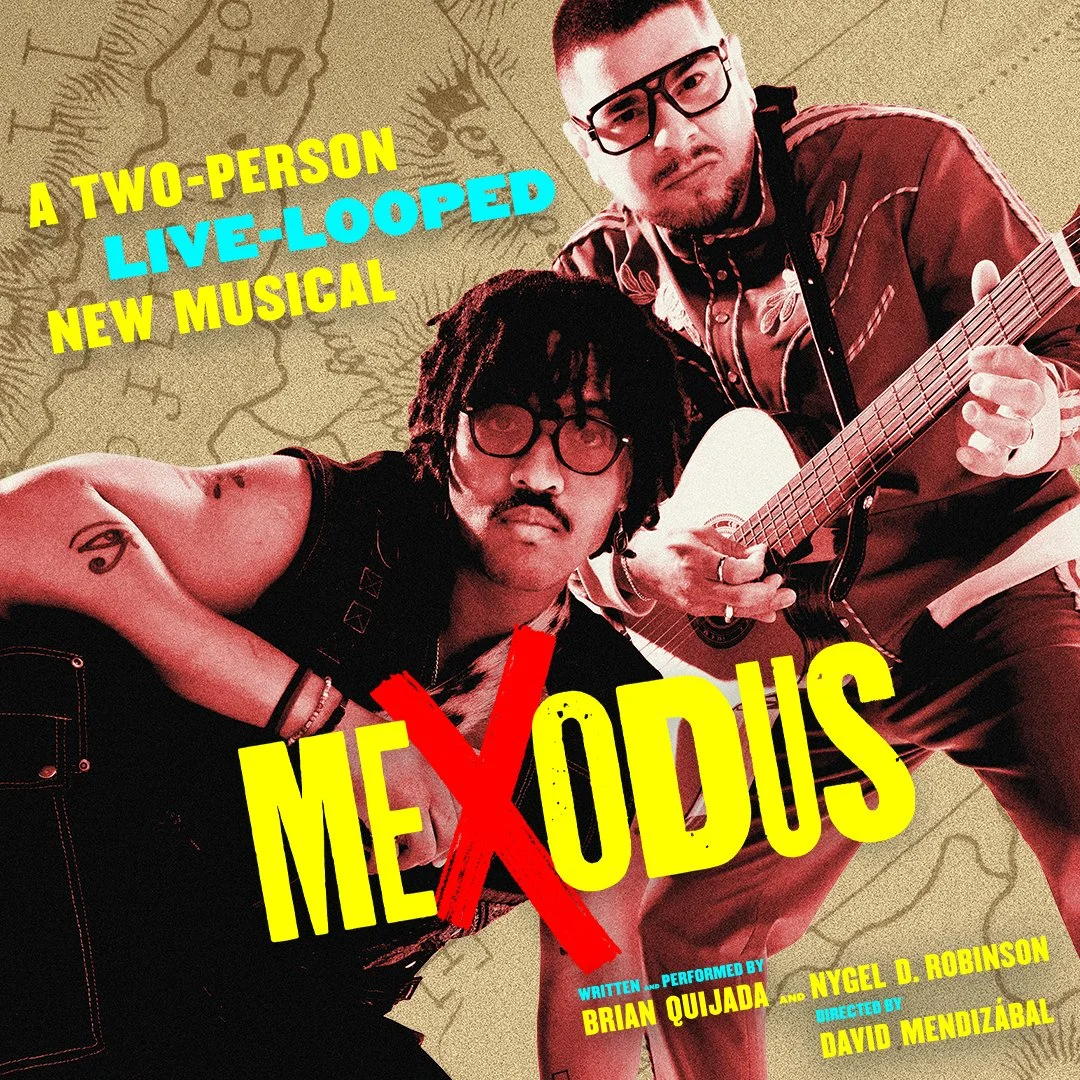
Mexodus - Off Broadway
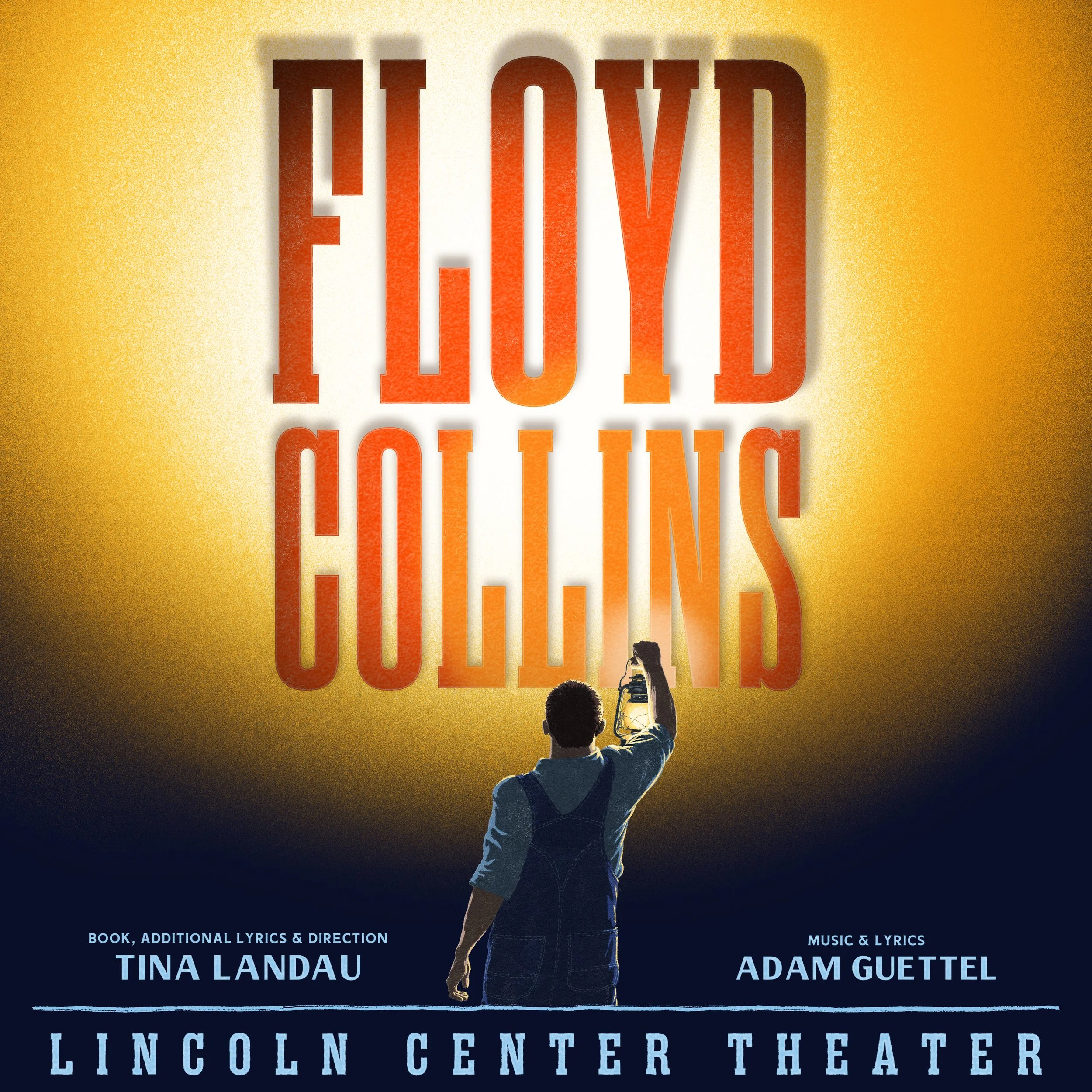
Floyd Collins -Broadway
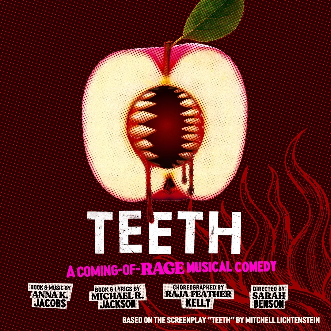
Teeth - Off Broadway

Certa Dose
Louie Husted

Print Making